Review I tried the new Arc Browser
You might have heard of "Arc" the new chromium-based browser. It's currently in closed beta, but I've got an invite via their website. I tried it, and currently stick with it for two months now. Here are my thoughts.

"Yet another browser? I stick to Chrome anyway."
At least, that's what I thought at first. But then I saw many people in my timeline bubble who wrote really positively about it and even made Arc their default browser. That caught my attention again, so I registered for an invite and got one two weeks later.
It's currently only available on MacOS, so I installed it on my M1 MacBook Pro, but they're working on a mobile and Windows version already.
So what features does it offer so far?
Features of Arc I use the most
Arc is a Chromium-based browser, so all your Chrome-Extensions will work right out of the box. There are many unique features of the browser already, but here are a some I personally like and use the most:
Sidebar
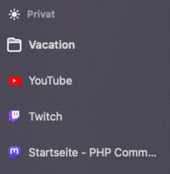
The core concept of Arc is to have a sidebar on the left side, where all your tabs and sites live. Nothing special so far. But there's more to it, because almost all features I will talk about next, will have their place there.
Favorite Sites

You can have favorite sites as little tiles, which always load if you start Arc. I use this feature for my daily work tools like GMail, Google Calendar or GitLab. There are some integrations for some sites already. For example, you can link your Google Calendar or GMail with Arc and get little pop outs for upcoming events or new mails.
If you double-click on one of the tiles, the site will load its initial URL. So if the site you are using doesn't have a link to your most used page at all times, you can go to it very fast by just double-clicking the tile.
Pinned Sites

Similar to the favorite sites, you can have pinned Sites too. They have the same functionality as favorite Sites, except that they don't load immediately on startup and are shown as a list instead of tiles.
Pinned sites may also live in a folder or subfolder. You can rename them or change the icon. Similar to the favorite sites, they also remember their initial URL and you have the ability to go back to that initial URL, by clicking the site icon.
Notes and Easels
Besides sites, you can also create notes or draw easels and pin them to the sidebar. For easels, there's a neat feature that allows you to capture and insert a live updating "screenshot". Every time you view that easel, it updates the screenshot with the new content of that captured page section. I use this to monitor my newsletter subscribers, so I don't need to actually visit that sites.
Split-View
That's properly the best feature for me, as it allows you to split any tab or note with another. At work, I use it to write notes while calling with clients or colleagues.
It's also great for every case where you need to read information from one page and write stuff on another. And yes, you could use a second screen for that, but sometimes I find it more convenient to have it on the same screen and don't need to move my head every time I switch to the other page.
That said, there's currently one weird behavior: If you enter split view with one pinned or favorite site, the split view opens up that site again in the regular tab section. That's a big problem, when the pinned site is a meeting app, or something else that connects to a live service, because then you join that call or connection twice!
The workaround for this is to just don't pin or favorite these apps / sites, but for me, the purpose of that feature gets lost, as I need these sites every day and would like to have them all pinned.
@Arc-Team: Please fix this 🙏
"Little Arc"
"Little Arc" is like the desktop variant of the "web view" feature in every iOS or Android app. If Arc is configured as your default browser, It opens up links that are outside of Arc (like Slack, Discord etc.) in an extra "little" window right where your cursor is.
This allows you to open up links that are sent to you in another app to have a quick look. You can close it afterward, or you send it to your normal Arc browser window and continue from there.
It sounds a bit weird at first, but after I tested it for myself, I like the fact that it opens up where you click, and you don't need to switch to your normal browser immediately.
Library
The Library is where you can access all your recent files, screenshots, downloads, desktop files, documents and notes. For me, again, it's very convenient to not have to leave the browser window to access those files and instead have everything in one place, available to me with just one click.
Spaces
Last but no least, spaces! You can have multiple spaces with different colored backgrounds to organize your pinned sites and opened tabs. Personalty, I don't use them as much and just have one space for work and one for my personal sites. It's good that this feature exists, but there's not much more to say about it.
Conclusion
For me, this is the perfect browser for work, so I use it as my default browser on my Mac for some months now. I really like the split-view, notes and easy access to all of my sites and files. I'm looking forward to the upcoming updates and features. The Arc-Team is dropping them every week, which is really impressive!
At home on my gaming PC, even if there would be a Windows version already, I would still stick to Chrome, because I don't need those work focused features there.
Invites
If you want to try out Arc for yourself, hit me up on Mastodon or Twitter, and I'll send you an invitation link. Currently, I've 5 invites left.